COLORS IN BRANDING
The colors you choose aren’t just about looking pretty—they’re about communicating who you are and what your brand stands for. Here are a few tips to keep in mind:
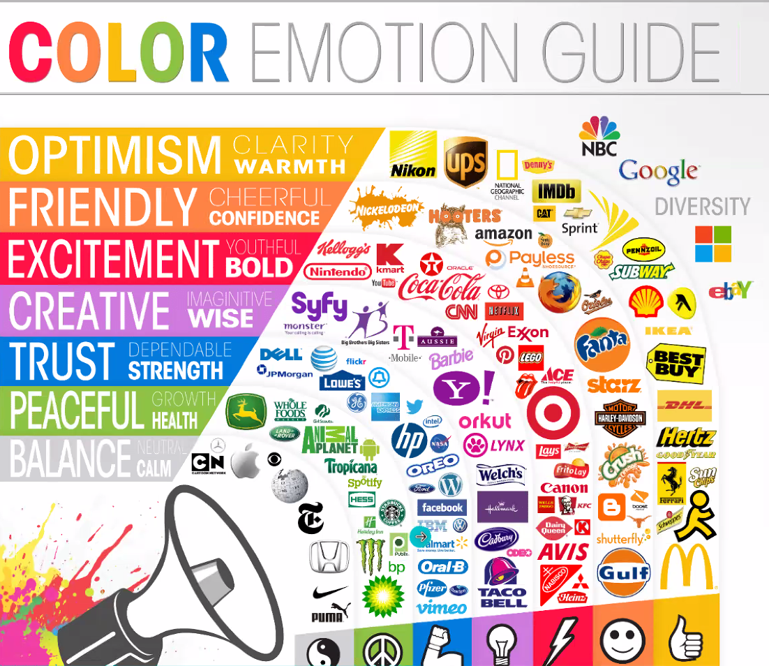
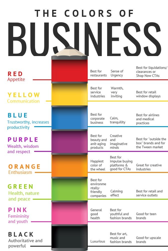
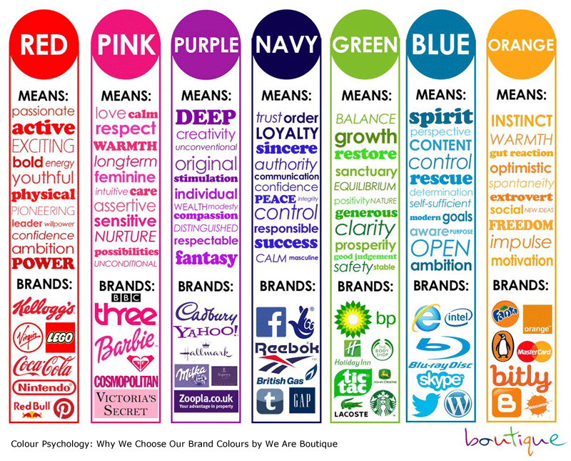
🎨 RED: Bold, energetic, and attention-grabbing to convey passion and excitement.
🎨 BLUE: Trustworthy, calming, and dependable focused on professionalism or wellness.
🎨 YELLOW: Cheerful, optimistic, and friendly to spread positivity.
🎨 GREEN: Balanced, natural, and refreshing relating to health, nature, or growth.
🎨 PURPLE: Luxurious, creative, and mysterious to feel premium or innovative.
🎨 ORANGE: Enthusiasm, creativity, and warmth to evoke feelings of excitement, friendliness, and energy.
🎨 BLACK: Clean and modern look signifying authority and power.
🎨
WHITE: Clean and symbolizes innocence and purity.

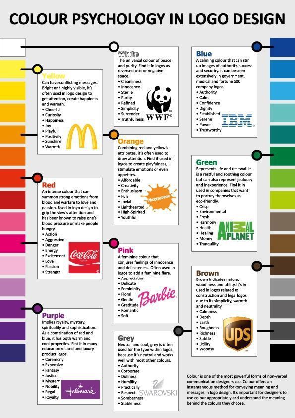
By carefully selecting colors, designers can create logos that visually represent a brand and communicate its core values and desired brand personality. Understanding color psychology allows designers to craft logos that resonate with the target audience and leave a lasting impression.
YELLOW: Yellow is cheery and stimulates the brain. It is the color of new ideas and inquisitiveness. But it can also be overwhelming if there’s too much or if it’s too bright.
ORANGE: Orange is often associated with enthusiasm, creativity, and warmth. It is a vibrant color that can evoke feelings of excitement, friendliness, and energy. Orange can be an effective way to convey a sense of playfulness and approachability, often used to stand out and capture attention.
RED: Red attracts attention and projects energy and excitement. It can also convey intensity and sometimes anger.
PURPLE: Purple shades have been shown to help balance the mind and calm fears. Purple can also convey royalty, wealth, femininity, and wisdom. Combining the energy and strength of red with the spirituality and integrity of blue, it stimulates the imagination and inspires.
BLUE: Blue puts people in a good mood and creates a sense of calmness. Watch out, though: Some shades of blue can seem cold and institutional.
GREEN: Green is calming and can symbolize luck, generosity, peace, the environment, and wealth. Green and white look great together. Green is positive and nurturing. On the negative side, green can imply materialism and a possessive nature.
BLACK: For a clean and modern look, shades of black and gray are recommended. These shades can also signify authority and power. Be careful with how much black you use, as it can imply evil. In marketing materials, black stands out the best against other colors.
WHITE: White is clean and symbolizes innocence and purity. It’s simple and light; other colors stand out best against white. Too much white could come off as stark and cold.
- Bright, vibrant colors can sometimes make people squint and cause headaches if used over too large an area or too frequently. Use these shades sparingly and combine them with neutrals.
- High-contrast colors work well when seen from a distance. Use contrasting colors in your store signage and in presentations to large groups.
- If you’re not sure what colors work well together, look at common color schemes.
- Search the Web for websites you like and take note of the colors used and what caught your attention.
- Don’t use complementary colors together (colors that are across from one another on the color wheel, like red and green or yellow and purple).
- Different colors can attract different kinds of shoppers. For instance, red/orange and royal blue attract impulse buyers, while teal and navy attract shoppers on a budget.